
Please pardon me while I take a break from obsessing over game design long enough to obsess over graphic design. Specifically, typefaces.
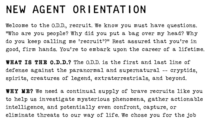
If one of my students had turned in a 40-page book in a novelty typeface back when I was teaching design classes, I would’ve docked their grade for it. I gave myself a pass for Agents of the O.D.D. because it was just too damn much fun to write the thing in a purposefully uneven and distressed font that looks like it came from a janky old typewriter. My doubts caught up with me while reading over the rules during editing, though. How much legibility is too much to sacrifice in the name of fun?
If it were just a matter of legibility, I might’ve been able to shake this doubt off by reassuring myself that I can also release a plain-text version that’s friendlier for text-to-speech readers. No less worrisome, to me, was the fact that the metaphor of typewritten pages kind of broke down the more I looked at the document. RPG texts of a certain length need headings and contrast to make them easy to skim as reference materials; memos and letters typed on a typewriter tend to lack such features, save for the occasional bit of standardized letterhead. A faded and distressed style wouldn’t necessarily be too bothersome for a short RPG, and then I might feel like I could commit more to a visual style that looks straight from a hastily photocopied government document. See, for instance, the downloadable sample for another typewriter font, FF Trixie.
I could do that. But should I? Even if I were to go with a font with a more even baseline than Silk Remington, like FF Trixie, the fading, distortion, and possibly mixed metaphors are still a lot to deal with for a document of 40 pages (and counting).
So I started experimenting with other options.

Cleaner and more typewriter fonts like American Typewriter and Prestige Elite were certainly easier to read, but kind of missed the entire point of using a typewriter font.
Conventional wisdom suggests that you ought to use a serif typeface for longer texts, so I tried a couple that looked less “fancy” and more “serious” to my eyes. Honestly, though, this just made me feel like I was reading somebody else’s book. Utopia and Minion both looked good—they just didn’t look like a training manual for a sketchy, eccentric, quasi-governmental agency that’s trying to keep the world safe from (or at least ignorant of) aliens, monsters, and oddballs like the player characters. I wondered if I might be able to get away with a relatively readable sans serif for the whole thing.

I was using Trade Gothic in some other places (just because it looks great when you type “TOP SECRET” in condensed bold caps, even though I don’t actually do that anywhere), so I figured I’d see how it looks for the whole document. It’s okay, but I worry it’s a little too dense and not very easy to scan, with less contrast between bold and regular than I want.
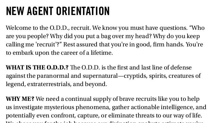
Avenir Next feels very promising to me. Inspired by Futura (which would be familiar to fans of Fallout video games), its bold condensed face has a sort of claustrophobic urgency, and it just feels kind of weirdly sure of its own cleanliness and precision. I also appreciate the huge contrast between the bold and regular weights, making it way easier to skim.

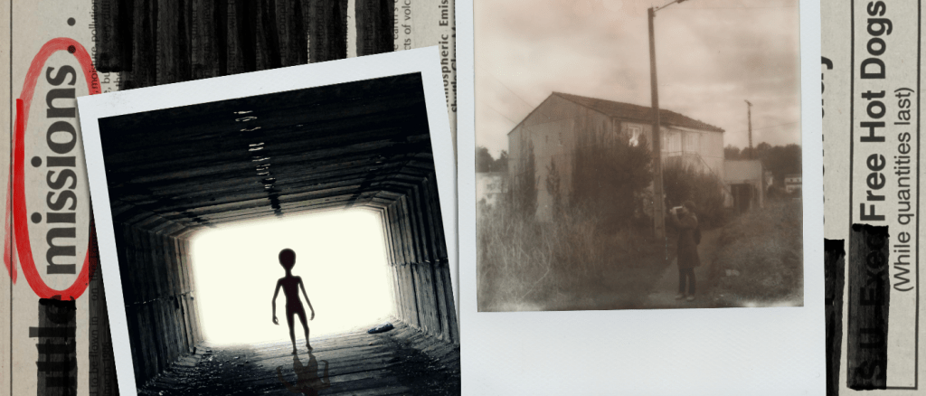
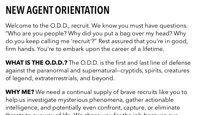
I told myself when I started this game that I wasn’t going to just use Helvetica again. I would use a wacky font that would be fun to type in! (Yes, I type right into my layout program when I write games. I’m a damn rebel.) But I have to admit: Helvetica Neue might be an unexpectedly good fit for this project. As Bethany Harvey assured me, “I 100% buy that this is what a shady government agency’s handbooks would look like.” Its impersonal genericness might actually be an asset in this particular case.
I’m pretty torn between Helvetica Neue and Avenir Next right now, but also quite open to other feedback. (I’d also dearly love an excuse to convert the whole thing to FF Trixie, but after spending $30 on one typewriter font I may never use, I should probably be more wary about spending $100 on another typewriter font I may never use.) So, graphic design enthusiasts and RPG readers of the world, please do feel welcome to share your wisdom of fonts with me.

3 responses to “Fonts of wisdom”
I’d say try headers/bolded in-lines in American Typewriter and plain body in Avenir.
Also, if you go for soulless, faceless and corporate with bad taste, you can use Arial instead of Helvetica.
I’ll never give up my Futura Round, but I absolutely feel your pain when the theme you’re going for runs up against the reality of what you’re actually making. Avenir Next gets my vote FWIW.